The days of competition-free SaaS products are far behind us. The SaaS ecosystem started going through explosive growth in 2014 and has never stopped expanding ever since. As a result, this brought us to the relatively saturated and exceptionally competitive market we’re in today. SaaS businesses need to bring their UX A game in order to satisfy their customers’ needs and ensure an optimal experience.
And in this article, we’ll help you do just that. We’ll take a closer look at the things that cause unnecessary friction in your SaaS product, touch on the best practices in SaaS navigation UX, and much more.
Let’s dive right in, shall we?

Essential Things To Keep an Eye On
First things first, let’s talk about the most important things to take into account to ensure an excellent navigation for your SaaS products and how to avoid some common pitfalls.
Listen to your users
All products should be built around their users, and SaaS businesses are no exception. However, given that these kinds of services are typically subscription-based, companies must continuously listen to what their customers have to say and adapt to the ever-changing technological landscape on a regular basis.

Given how prone to change the modern business ecosystem is, it’s absolutely essential that products with this delivery model establish a continuous flow of feedback from their customers in order to inform future changes and improvements. Being able to preempt your users’ expectations is a recipe for success in this field.
Wondering why?
For instance, a study conducted by Acquia indicates that about 50% of the people they interviewed feel like products fail to meet their experience standards. More importantly, around 65% of the survey participants can’t point to a time when their expectations were exceeded.

There’s is absolutely no way you can exceed your customers’ expectations without understanding them in the first place.
Here are a few things to keep in mind:
- A relatively recent metric that entered the SaaS field is “shelfware,” which is pretty much the opposite of consumption. Fundamentally, it reflects the percentage of people that continue paying for your services but don’t use them. Establish meaningful communication channels with these people and learn how you can improve their experience.
- Another term that made it to the SaaS design jargon is “consumability”. This concept is somewhat similar to usability, but it predominantly focuses on how easy to consume your product is—this is typically done through extensive user research and ensuring that you’re providing maximum value to your customers.
Creating a product with an optimal experience and navigation is a matter of understanding your customer’s thought process and understanding their goals and aspirations.
Align Your Copy With User Goals
We’ve all heard this UX mantra hundreds of times: “You are not your user.” Typically, people use it to underline that we shouldn’t make design-related assumptions on our users’ behalf. However, we often forget to attribute it to copy as well.
Even if your audience is tech-savvy, it’s still essential to avoid excessive technical jargon whenever you can—it can create too much friction where it serves no purpose. This applies to both product and marketing copy.
As a result of using too much complex niche jargon, you risk seeing diminishing conversion rates, as well as overall product adoption rates due to clunky usability.
On the other hand, a well-thought-out copy will empower your users to see the actual value of your service and skyrocket their engagement and reduce churn rates.
Here are a few things to keep in mind when writing copy for your SaaS product:
- Understand the difference between content and context, but more importantly, make sure that they work together.
- Guide your users through your product with microcopy (button labels, descriptions, explanations) and macro copy (instructions, informative emails, etc.).
Align SaaS Navigation UX With User Goals
Goal alignment is one of the most overlooked facets of SaaS UX design, which is unfortunate given how important it is in shaping the way users interact with a product.
Fundamentally, a good SaaS design must enable users to navigate your product in a way that would surface its value.
Your goal is to make it easy for your customers to be where they need to be.
Structure your experience with visual cues in mind—make it obvious for people to find what they need without investing too much effort and thought into it.
Let’s take SaaS dashboards as an example.
Most of the problems with SaaS navigation UX revolve around designing experiences without the user in mind. One of the most critical issues in this category is poor information architecture (IA).
The central IA principle is pretty straightforward: the most important data should be the most visible. But here’s the catch—if you don’t have plenty of user research to inform these decisions, you may lack an in-depth understanding of what your users really want to know.
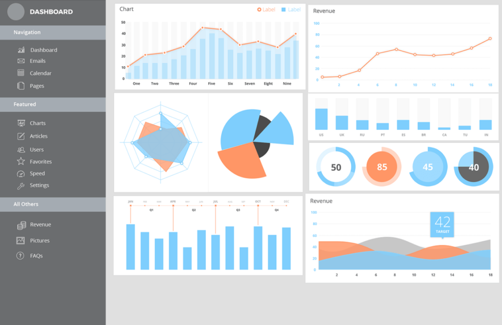
Let’s make some observations:
- We can clearly see that all seven groups of charts below appear to be of equal importance, which as a result, makes them kind of equally trivial.
- The page looks pretty cluttered, which can distract users from completing the tasks that they set out to do in the first place.
- The arrangement is fairly careless. The value of any real estate, visual included, revolves around location and context—something that appears to be lacking in this example.
- There’s a near-total lack of focus, which kind of goes hand in hand with a lack of clear information hierarchy.
This bears the question, “how do I actually nail SaaS navigation UX?”
Here’s a quick rundown of our recommendations for flawless SaaS design:
- Ensure that your users find your product clear and intuitive—this can be achieved through extensive usability testing.
- Align navigation with user goals—guide them through your product straight to achieving their goals.
- Identify the best navigation pattern. You can choose from three common patterns in SaaS—horizontal (widely considered the most intuitive one), vertical (allows scrolling, perfect for complex content-rich products), and a combination of the two (good for products with complex information architecture).
- Use hamburger menus—they help users access your product’s most important features quickly.
You might be also interested in : SaaS Application Development in 2022 – An Introduction for Founders
The Bottom line
Intuitive SaaS navigation UX is a defining factor for a SaaS product’s success—but it’s easier said than done. Ensuring that your users will use your product smoothly and efficiently is a matter of UX research, thoughtful copy, and empathetic design.
